Generative AI Artwork and Logos
- Christina Wolfe
- Aug 10
- 2 min read
Generative AI artwork and logos are all the rage. I get it, it's quick and fairly easy for a non graphic designer to use. To the customer it's fantastic art. To the sign shop or print shop it's a headache.
Some of the problems with AI artwork is the "transparent" backgrounds. AI doesn't always understand that a gray and white checker pattern is supposed to mean transparent. Instead of making it without a background, it adds the checkers. Then the customer will send the file thinking it's transparent and it is not and depending on the quality of the image it can be a real pain to remove that checker background.
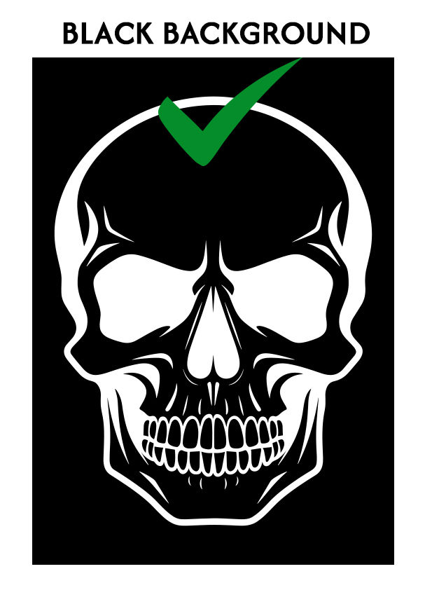
When creating AI artwork it's best to use a contrasting color for the background. For example, a black background for a white or light color design or a white background with black or dark color design. If you have a full color design with a black outline ask for a white background, If you want it with a white outline ask for a dark background.
Another major issue is fonts. AI is generating the font as artwork, it's not an actual font and as a graphic company we can't take that made up font, find the match, and use it with the rest of your branding.
Costs. Many generative AI companies charge to download the design that is requested. To get away without paying a user will take a screenshot of the design. Sending screenshots are often low quality and quite pixelated (blurry), enlarging a blurry file will become even more blurry. Please send the actual file not a screenshot.
And as always png files are NOT vector art, no matter what a website says. It's no different than a jpg other than if done correctly it can have a transparent background.
 |  |  |


Comments